Wavence
Take Control of Your Finance
A smart and minimalistic landing page for a finance management app that helps users make better financial decisions, track their spending, and save effortlessly.
.png)
Vision of the project
The goal was to design a conversion-oriented landing page that showcases the benefits of the Wavence app, builds trust, and encourages users to download it.
We aimed for a clean, modern, and slightly futuristic look to convey professionalism and innovation in the financial space.
The problem
Many financial tools present overwhelming dashboards, confusing charts, or a cluttered experience that intimidates non-experts.
Users struggle to find tools that feel both trustworthy and friendly, especially when it comes to daily finance tracking and savings habits.
The research process
-
Competitive analysis of 5 top finance apps (Mint, YNAB, Emma, Cleo, and Wallet)
-
Identified common patterns: credibility indicators, testimonials, simple flows
-
User interviews: 3 participants shared that they prefer quick, intuitive dashboards and hate "cold" or technical interfaces
Affinity Mapping
Grouped insights around:
-
Trust-building elements (testimonials, badges)
-
App utility (notifications, easy tracking)
-
Visual feel (approachable, calming, clean)
-
Decision making (comparison tools, data clarity)
.jpg)
Empathy Map
The empathy map captured what users think, feel, say, and do during the contract creation process. It helped uncover emotional pain points—like stress, fear of mistakes, and feeling overwhelmed—which guided more intuitive and reassuring design choices.
.jpg)
Brainstorming and HMWs
A structured brainstorming session using the “How Might We” method helped turn user pain points into actionable design questions. This encouraged creative thinking and led to solution-focused ideas tailored to real user needs.
.jpg)
User Flow & Wireframes
The site was planned as a scroll-first landing page with a clear conversion flow.
Low-fidelity wireframes were created to define structure before moving to final visuals.

High fidelity
Hero Section
A clean and bold first impression with a clear message and direct CTA.
This section includes the headline “Take control of your finances,” a mockup of the mobile app, and buttons to download the app. The combination of confident typography and soft gradients sets a trustworthy tone.
.png)
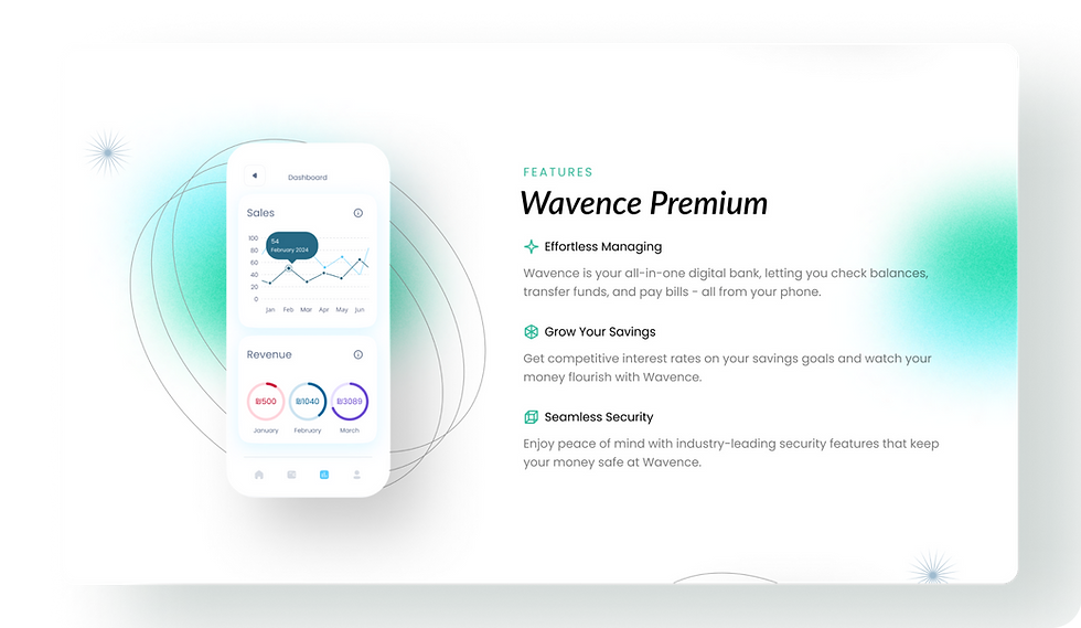
Features
An icon-driven layout showcasing the app’s key benefits.
Here we highlight smart saving, intuitive insights, and personalized financial tracking. The visual separation and minimal copy make the features feel light and accessible.
.png)
Why Wavence
Differentiating the app from competitors through relatable messaging.
This section explains why Wavence is different — focusing on clarity, simplicity, and user empowerment. Each point is backed by visuals and microcopy that connects emotionally.
.png)
Testimonials
User reviews that build trust and community.
This area presents short testimonials with photos and names, giving the brand a more human and social feel. It creates social proof without overwhelming the layout.
.png)
FAQ
Answering objections to help drive conversion.
Simple, collapsible questions reassure users about data security, pricing, and app features — all while keeping the design streamlined and approachable.
.png)
Call-to-Action
A focused CTA block designed to convert.
The download buttons are reinforced with app store badges, surrounded by whitespace and visual anchors that guide attention. This is where users are encouraged to take the final step.
.png)
Wrap up
Designing Wavence was all about balancing clarity, trust, and motivation. The challenge was to make personal finance feel less intimidating and more empowering — while keeping the message clean and conversion-focused.
Throughout the process, I prioritized content hierarchy, visual consistency, and emotional tone. By combining friendly microcopy, bold CTAs, and a structured layout, the landing page guides users from curiosity to confident action.
If I had more time, I’d A/B test different hero headlines and CTA placements, and explore animation to further enhance engagement.
My biggest takeaway? Simplicity isn't just a visual style — it's a strategy. The more effortlessly users understand what you're offering, the more likely they are to say “yes.”
Full Website
.png)